Pacsun – PS Rewards
ROLE: Design Director
CLIENT: Pacsun
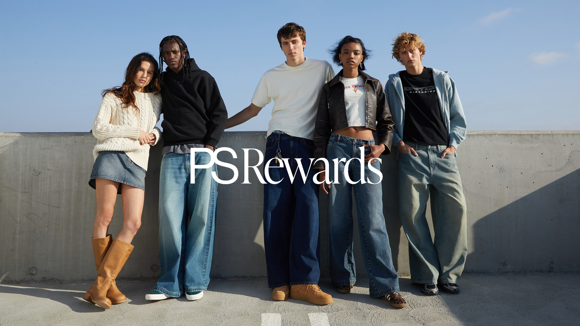
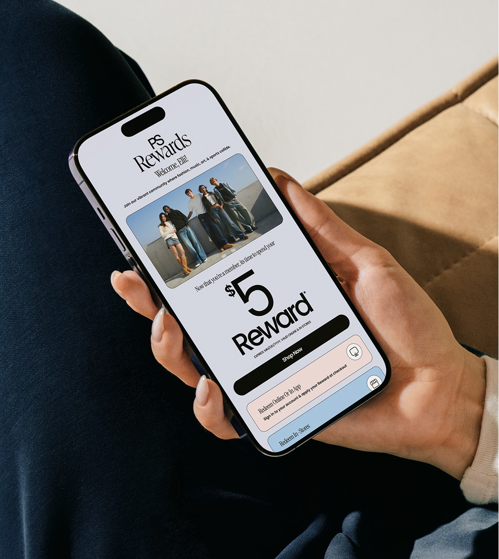
PS Rewards, (Pacsun’s loyalty program), offers customers points for shopping and engaging with the brand. Previously a five-tier system, the program lacked differentiation, clarity, and personality. As design lead, I reimagined the experience with a gamified, digital-forward identity—making rewards feel exciting, digestible, and distinctly Pacsun.
Program System
The new system pairs Instrument Serif and Poppins, (Pacsun’s brand font) for elevated moments of contrast.
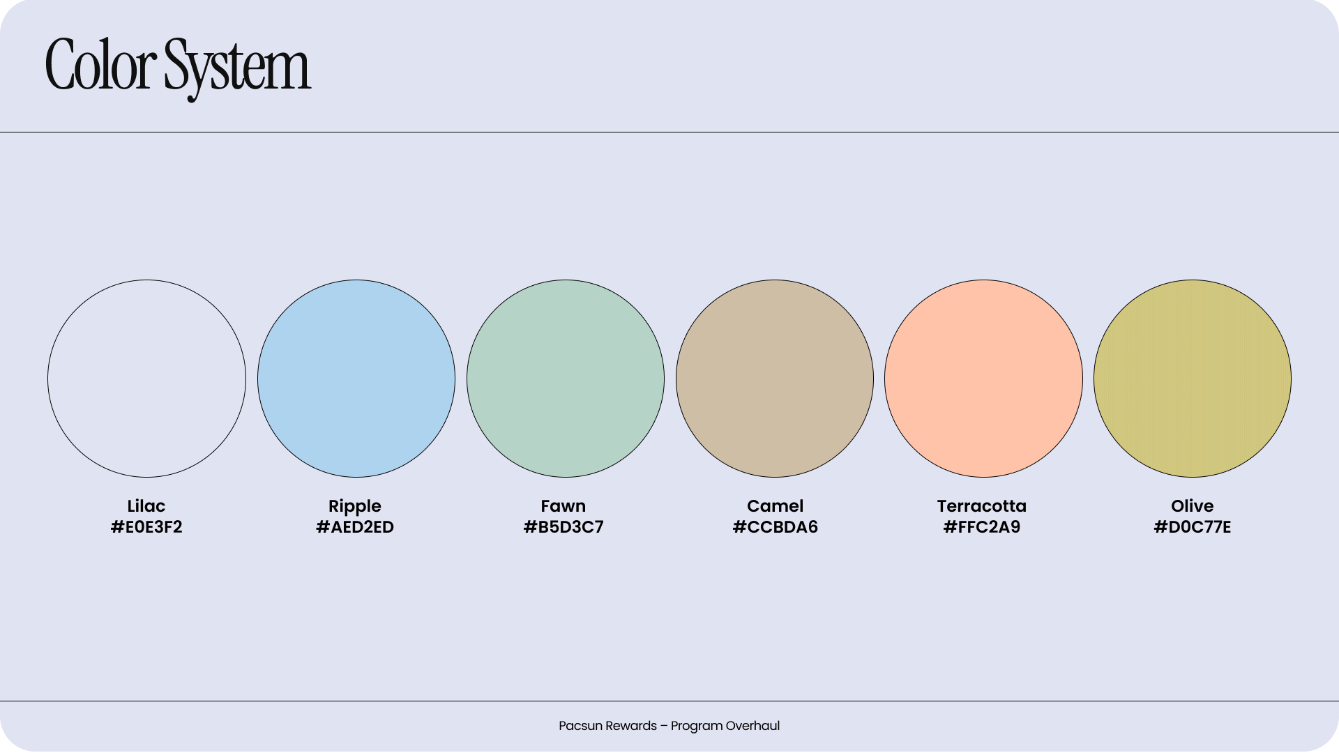
A flexible, gender-neutral color palette was introduced to appeal to Pacsun’s younger demographic. The visual language leans into 3D icons, avatars, and playful
flourishes, bringing intrigue and heirachy to what had previously been a templatized program.

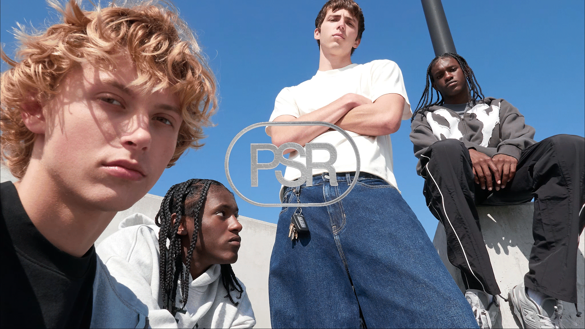
LOGO
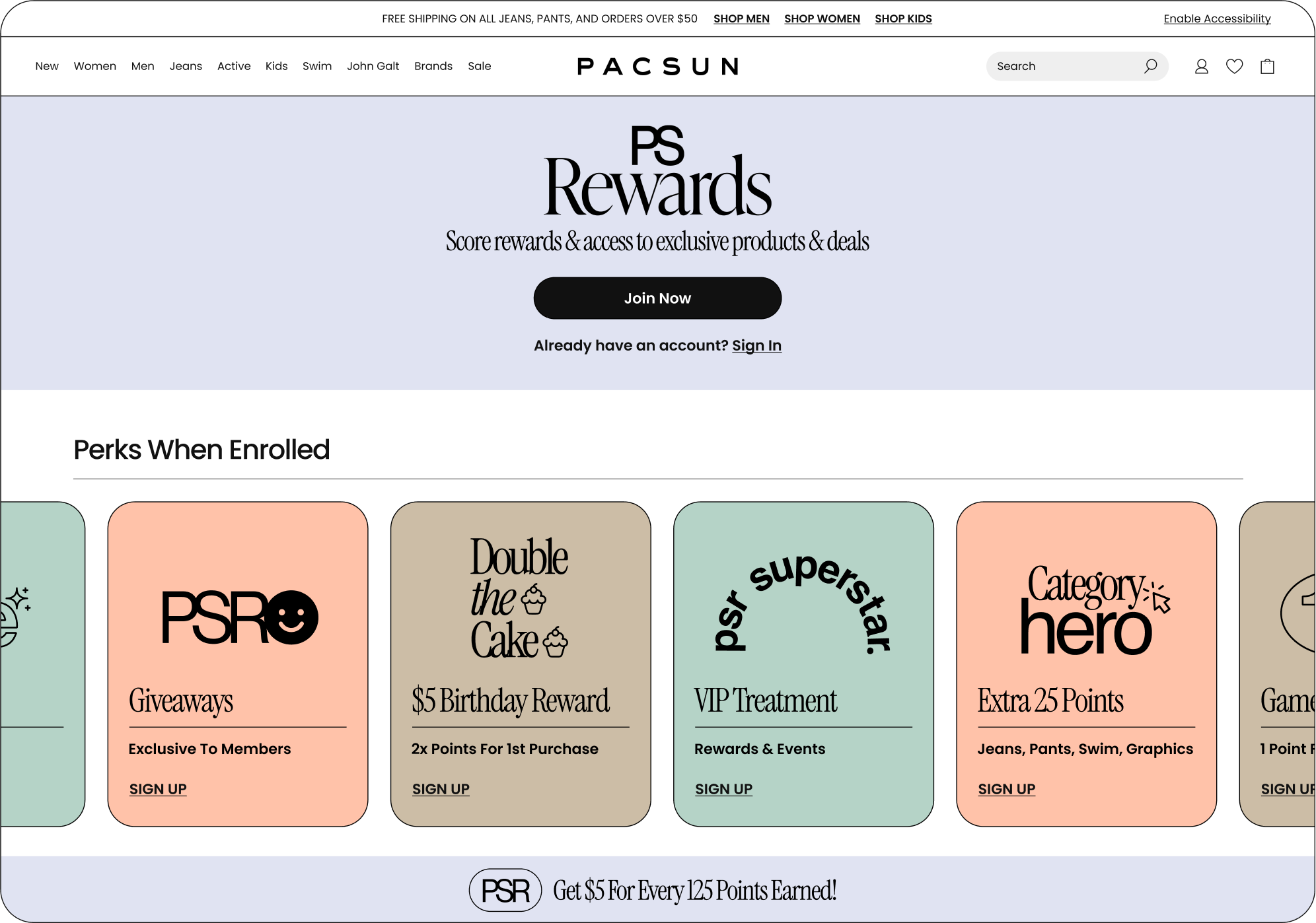
I developed a three-part logo system for maximum adaptability: a one-line wordmark, a stacked lockup, and a monogram version. This flexibility ensured legibility across platforms from digital dashboards to in-store signage, while allowing the program identity to feel cohesive yet dynamic.
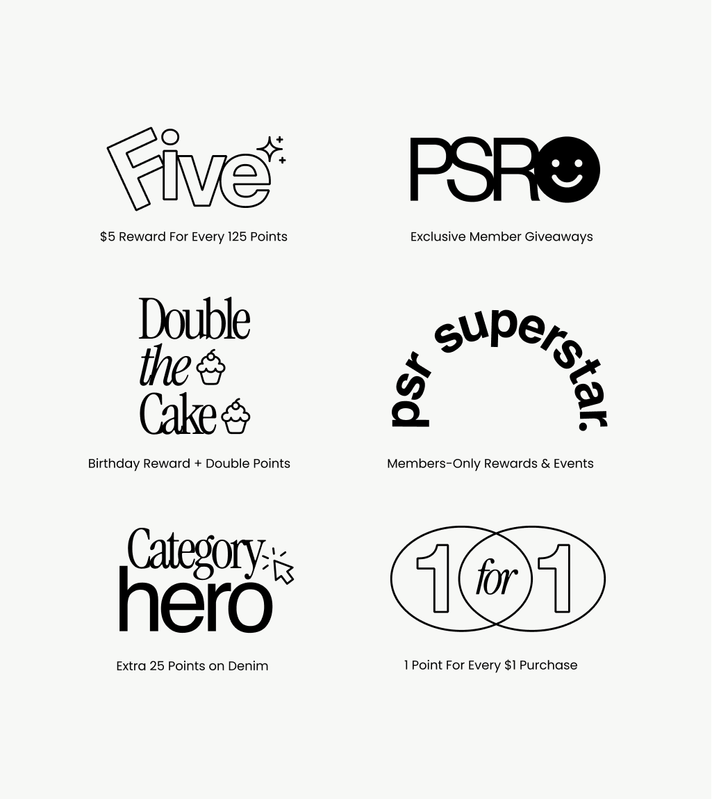
PROGRAM PERKS
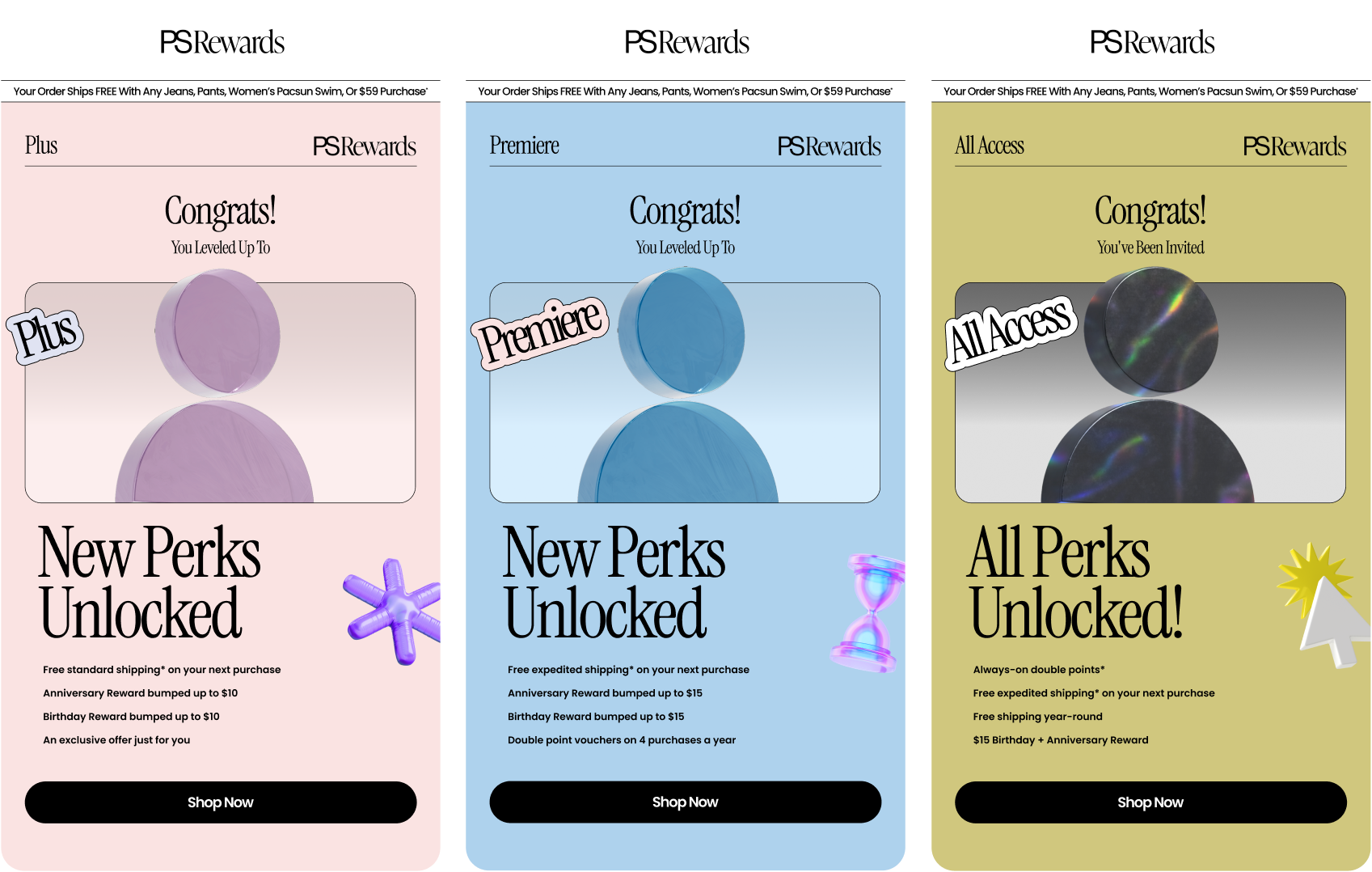
The restructured rewards journey was reduced to three tiers: Plus, Premiere, and All Access. Each are anchored
by a custom profile avatar for clear differentiation. Program benefits are re-prioritized and placed front and center, supported by iconography systems that make earning and redeeming feel intuitive. UX icons provide navigational clarity, while 3D icons add moments of delight, emphasizing the gamified approach. The result: a program that feels rewarding before the customer even redeems points.
Customer Engagement
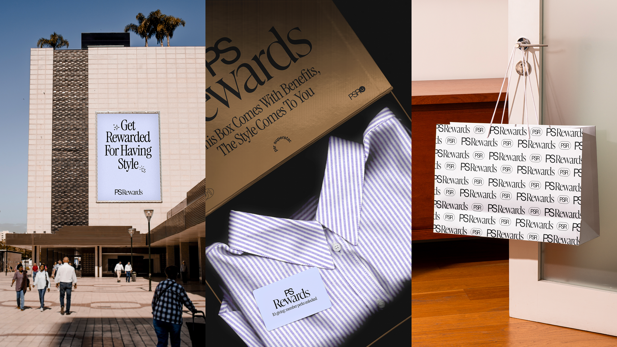
The campaign was rolled out across tier-1 malls in the U.S., featuring program awareness and sign-up prompts. Influencers received curated packages that detailed program education, thus creating organic social content that both informed and excited audiences.